João Machado is an internationally known designer based in Portugal. Although his first love is poster design, he began designing stamps for Portugal’s national postal service in the 1980s. Since then, he has designed dozens of stamps celebrating Portugal’s national culture, ecosystems, industries, and aspirations.

Sometime ago, João very generously shared his time and perspectives with Clarisse (aka CStar9) via email and postal mail.

- You are internationally known for your poster designs. How did you begin designing stamps, which are at a very different spatial scale?
-
I started designing stamps in 1987 at the request of CTT – Correios de Portugal (aka, the Portuguese Post).
I made my first stamp for the centenary of the vinyl record. It was a stamp made manually (drawn and colored) without the help of computers.
- What are the primary tools you use in your work?
My first work as a graphic designer was illustrating children’s books. I used pastel and cardboard templates that helped me define the shapes of each drawing. I also drew a lot with India ink.
Later, in the 70s, when posters became my great passion, I drew everything manually, using the airbrush, cutouts, and collages.
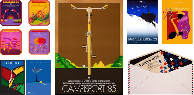
A selection of Machado’s early posters In 1987, I bought my first computer, but it was only later, in 1993, that I started using it 100%.
- You’ve even designed a stamp on cork! Can you tell us about that?
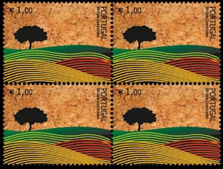
I designed this stamp on ‘cork paper’ in 2007, at the request of Corticeira Amorim, a company that leads the world in this sector. This is the first stamp made in this material for Correios de Portugal, and the production was backed by Parliament.
Cork is Portugal’s only world-leading industrial sector, and the cork and cork tree are national symbols. The tree – which may live as many as two hundred years – is mainly concentrated in the centre and the south of Portugal.
- Your vibrant color palette is incredible! Is it inspired by your environment or does it simply exist in your creative imagination?
There are many subjects, places, sounds, images, and even dreams that have obviously had an impact on my color palette and in my way of being an artist. I have always lived in the North of Portugal, next to the river and the sea. The northern region has always been much richer and more prolific in the colors of its crafts. But in a more general way, I am European and this geographic reality strongly influences my personality.
Influences are inevitable when we live in an open society. I’ve traveled a lot and contact with other international designers has been constant. No doubt I was influenced by the impact of Pop Art: I can highlight the influence of Heinz Edelmann, Milton Glaser, and Seymour Chwast. I remember my early works as an illustrator and poster designer were made during the 1960s, listening to the Beatles.
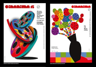
Two of Machado’s posters for the International Animated Film Festival I ended up creating a very unique chromatic code, with vibrant, clean and sharp colors, articulated without any concern for classical correspondence. For example, green does not always mean hope; black does not always mean mourning. The color of the sun or the sea are those that my imagination and intuition decide to choose.
- You’ve said in a previous interview that when you approach a design, you try to land on the bright side of an issue. Can you give us an example?
I am by nature a pessimistic and introspective person, but in my work I am always focused on the positive side of the issue.
In other words, even if it is a delicate and irremediable subject, I always try to approach the content of the message in a positive and hopeful way. Environmental issues are examples of what I have just explained.

Machado stamps with a message - When did you first see yourself as an artist/designer?
-
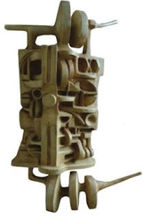
Machado. Without Title (I), 1967;
plaster; 59×38×15 cmSince I was very little, I had a tendency to draw. When I was 14 years old and went to high school, I remember that my exercise books were filled with varied comic strips, caricatures of the teachers, and other ideas that occurred to me during lessons. I’m sure that at this age I had already decided my future!
When choosing my university career, I chose Fine Arts, which at the time included painting, sculpture, and architecture. I opted for sculpture due to my passion for the three-dimensional and strong drawing components of the course.
Later on in my work as a designer, the impact of sculpture gave me a better understanding of the three-dimensionality and “sensuality” of forms, not just those of the human figure. But the color was missing!
Graphic design gradually appeared on my path. I made the choice to dedicate myself to it, studying, observing, and creating my own language. Now, I was making my own 'watermark’.

More of Machado’s stamps!
You can learn more about João on his website, or through one of the many documentaries and interviews or profiles he’s been featured on throughout the years.
And now, for a very special giveaway! Clarisse is going to send 3 of João Machado’s cork stamps to 3 randomly selected postcrossers. For a chance to win one of these exceptional specimens, let us know which stamp issue(s) from your country you consider to be the most beautiful — maybe one day, we’ll interview that stamp artist too! 😍 This giveaway will close on Saturday, November 1 November 8.
And the winners of this giveaway, as chosen by Paulo’s random number generator are… salcedou, an-foxy and Sudharshan! Congratulations, and thank you all for participating!


107 comments so far
One of my favourites is Christmas stamp from 1999 by Pirkko Vahtero. It pictures a winter landscape with two mountain hares and bullfinches.
Artist Michael Deas has created 25 stamps for the U.S. Postal Service. His subjects are certainly well-known, he's responsible for an impressive gallery of American icons. He represent that person at the high point of their life. He has painted everyone from U.S. Presidents (Gerald Ford, George H.W. Bush) to Hollywood stars (James Dean, Marilyn Monroe, Audrey Hepburn, Humphrey Bogart).
Great article. Thanks
The multi-layered illustration technique of the winter design stamps by artist Tim Zeitner here in Canada are, in my opinion, stunning. Every time I have used them on the postcards I send, the recipient comments on their beauty!
Loved this article and profile, thanks!
Because of all John Lennon espoused and hoped for the world I’ve treasured the US stamp of him photographed by Bob Gruen.
One of my favourite is Christmas stamp from 2024 it depicts Giulio Coniglio, a character created by the writer and illustrator Nicoletta Costa, protagonist of many comic book adventures
I can’t think of any US stamps in color or design as remarkable as the art depicted in Machado’s.
Our 2018 Banksia Stamps designed by Celia Rosser are some of my all time favourites! I love the different banksia flowers on each stamp and the colour palette is very complimentary! I only have a handful left, so I don’t use them as much anymore!
These are truly beautiful!!! 💕
Beautiful!
I really love the "Art of Magic" stamps by Jay Fletcher. They are so striking!
The Kumbh Mela stamp design from our country came out very nicely this year - https://stampsofindia.com/lists/stamps/ms/Feb14_0001%20(FILEminimizer).jpg
Thank you for this post and for giving me a deeper appreciation of the graphic designers behind the stamps we love. Each year I eagerly anticipate the US stamps from the Black Heritage issue/series. My favorite so far: Toni Morrison (author).
Thank you for this informative article! P.S. My favorite stamps are actually from the United Kingdom, even though I don't live there. I adore the Great British Fashion stamps from 2012. The stamps were designed by Johnson Banks.
This is a very interesting artivle and beautifully presented. Thank you and well done!
I am simply stunned by the cork stamp. To commemorate the cork tree is wonderful enough, but for the stamp to be visibly made of cork. is so very wonderful!!!!
Hello! So nice to see this article on this wonderful website! It is very informative! My favourite stamp from my country India is our United Nations He for She stamps! It aims to promote gender equality.
I like the lunar New Year’s stamps designed by Camille Chew. They are very stylish and nicely fit the theme of the stamp.
My favorite stamp is the 20th Daocheng Yading 4-4 stamp, issued last year in China. It depicts Nairixian, the northern peak of the Three Protectors Snow Mountain, at an elevation of 5,998.5 meters. This stamp utilizes a printing method combining offset printing, gravure printing, and cold foil. Using gravure thermochromic technology, it educates people about the greenhouse effect. When temperatures reach above 45°C, the snow-capped mountains depicted on the stamp change from white to gray. This design technique is designed to raise awareness of environmental protection, warn against the dangers of global warming, and jointly protect our planet.
Beautiful art, beautiful stamps. We're so lucky to meet those Artist trough Post-crossing. Thank you for sharing this article.
I like the artist International Film Festival posters shown in this article.Thanks
💕❤️🌞👋🏿
I love these colourful, beautiful stamps. Thank you so much for sharing.
It was interesting to read about João's journey from physical media to digital media. I never knew cork and cork trees were symbols of Portugal.
Similarly, one of my favourites is Iván Tortajada who brought the Valencian tradition of Fallera statues to stamps for the Disello contest with his stamp titled "Energía Verde".
Wow, those stamps are brilliant. Vibrant. Some more postal authorities should take note!
I do like the stamps USPS issued to celebrate Ansel Adams.
There are many gorgeous stamps, but I am fond of the Pinback stamps issued in the US in 2024. I like the upbeat messages.
What a great artist and designer. Thank you for the article.
We've had so many interesting and beautiful stamps over the years, but the cartoon Monster stamps from a couple of years ago comes to mind as one of the most fun. There were small stickers on the sides of each sheet of stamps so you could customize your monster on the stamp!
Thank you for sharing João's story - his work is beautiful. I love the colorful palette as well as his images.
A stamp made of cork is so cool. I did not know about Portugal & cork!
Very informative & beautiful story!
Thank you for this terrific article! One of my favorite US postage stamps is our 2017 Nebraska statehood stamp with photography by James Forsburg. I wish the USPS would continue to sell them.
I love series stamps by Jaromír a Libuše Knotek for example "Zvířata v naší přírodě s mláďaty" - 2024 (Animals in our nature with their young) or "Národní park Podyjí - 2023 (Podyji National Park) or Czech Europa stamp 2024
The recent Chronicle of Narnia stamps issued by Royal Mail are brilliantly done
I particularly love the floral geometry stamps the USPS has currently - the cork here are also beautiful!
My love has always been the USPS 2007 Stars Wars stamps. Drawn by the awesome Drew Struzan. He has done so many movie posters that everyone in the world has seen and loved. He passed away last week and the art world will never be the same.
These are exceptional and I'd love the chance to win some.
My favourite NZ stamp artists are Sumin Ha who did our official Postcrossing maxicard and stamp of the kiwi postie flying with aid from balloons. (Our nocturnal national kiwi bird is flightless). This was issued August 7, 2024.
My other favourite stamp artist is actually a book artist but I love that the 40th anniversary of Lynley Dodd's Hairy Maclary book series was immortalised in stamps and maxicard back in 2023.
I still have a few of those beautiful cards to send out and our Postcrossing official postcard. I love them so much.
In Spain, today we have very few artists working for the postal service, but I find Isabel Muguruza series very beautiful as a whole.
8M series all year
Since they added QR codes to all of the stamps I can't recommend German stamps.
The graphic designer Heinz Schillinger designed countless German stamps. I particularly love the “Landscapes in Germany” series. Sadly, the artist passed away in 2008.
What a great interview ! I like the Belgium designer Marijke Meersman (Créatures fabuleuses/ Fabelwezens).
Stamp Designer Thomas Steinacker made some cool ones, like a Ludwig van Beethoven (2020) and a David Bowie stamp (2022)
Great design, I love the colourful stamps...
Belarus Post (Belpost) issues many beautiful stamps. One of my favorite themes is flora and fauna. Recently, they released a scented stamp - wild strawberry 🍓
Thank you for this article. The colors and designs of the stamps are striking! Of the stamps in my country, I very much like the one-cent bobcat stamp that came out in 2012 in the USA. It is realistic- looking, and I find that type of art appealing. The artist is Nancy Stahl from New York.
In Germany it is for me really hard to tell these are great stamps, more and more AI generated or edited stamps are issued and these make me a bit sad.... tbh... but a older series I loved a lot was the "junge Wildtiere" (young wild animals) series. These were so cute - but only photostamps, so maybe not so interessting for a interview on the designer. I also loved the lighthouse stamps series. At first very consistent in their designe, gone quite wild in the end before it was stopped.
thank you for the lovely interview and great givaway
Romania’s 30 lei postage stamp issued on Friday 24th October to commemorate the consecration of the new National Cathedral on Sunday 26th is huge and beautiful.
My favourite Isle of Man stamps were 2023's Manx Winter Wildlife collection as they showed island landmarks with the wonderful wildlife in a festive setting, everyone got cards that Christmas and lots sent on postcards so I could use them, here's an article link to see them https://www.bbc.co.uk/news/world-europe-isle-of-man-67477397#:~:text=Designing%20the%20Isle%20of%20Man's,the%20animals%2C%22%20she%20said.&text=The%20Manx%20illustrator%20spent%20about,our%20phones%20and%20look%20around.%22
One of my fav is Royal Mail Presentation Pack no. 581 from 2020 featuring video games developed in the UK, including stamps with Tomb Raider.
Design on the square centimeter: Since childhood I'm impressed about all information on such a small piece of paper.
The corkstamp looks fabulous, since corks became of plastic I'm not so fond of wine anymore - I miss the charm of uncorking the bottle!
My favourite Dutch stamp is the only 3D stamp (serie of 2) issued by Dutch post ever, in 2008 (https://www.tweedehandswerk.nl/going-for-gold), not very artistic - but highly collectably wanted. The theme 'Going for Gold' is one of my favourite personal slogans in life. If I go for gold but I get silver or less it's fine as well - as long as I have geven for gold.
P.S. my fav stamps are plastic too. Contradictio....
My favorite Canadian stamp is "The ogopogo" released in 1990 with a series of illustrations based on Canadian Foklore. These were made based on illustrations by Allan Cormack and Deborah Drew-Brook
My favorite Belgian stamp designer was Jean-Michel Folon, unfortunately he is no longer among us, but his art remains a beautiful reminder of a great artist.
The 2019 US T-Rex lenticular stamps are some of my favorite US Stamps to date. Designed by Julius T. Csotonyi, they show the lifecycle of the Tyrannosaurus Rex and do so beautifully.
This year the most beautiful Correos de Mexico or Mexican Post stamps are 25 años Conservando las Áreas Naturales Protegidas (CONANP)/25 Years Conserving Protected Natural Areas (National Commission of Protected Natural Areas) designed by Astrid Domínguez Guerrero. They show the wonderful unique diversity of Mexico both in the sky, sea, and land using illustration and digital composition techniques.
Thank you!
China’s bird stamps!
The best postage stamp for me is “Ukrainian Carols in the Kyiv-Pechersk Lavra” of 2023. The issue is dedicated to a historical event – the anniversary of the Orthodox Church of Ukraine holding a Christmas service in the Assumption Cathedral of the Kyiv-Pechersk Lavra, which turned 950 years old.
The central stamp of the stamp depicts carolers in festive folk costumes. The action takes place against the background of the main iconostasis of the Assumption Cathedral, which is reproduced in the margins of the postage stamp.
On both sides of the iconostasis are depicted the founders of the Kyiv-Pechersk Lavra – the Venerable Anthony and Theodosius of Pechersk. The other two stamps depict the building of the Assumption Cathedral. One stamp depicts a church, reproduced from a 1623 engraving from the book “Conversations of Saint John Chrysostom.” This is the first known image of the Assumption Cathedral that has survived to this day. Another stamp depicts a modern church. The author of the block is Ukrainian artist Mykola Kochubey.
I like our comic stamp`s so much :-)
because the stamp from "Der kleine Drache Kokosnuss mit seinen Freunden auf dem Postfahrrad" (Bildrechte: © Ingo Siegner / Caligari / cbj Verlag 2025) is the best .
I like the Tom&Jerry stamp to.
Nice article and great artist too!
Many artists have designed stamps!
For example, to support the victims of the 1970 flood in Romania, a great Spanish artist designed a stamp to raise awareness and support.
See here the Romania issued a series of stamps in 1970 based on Joan Miró's work: https://filatelia.ro/timbre-romania-1970-1979/inundatia-ii-joan-miro-coala-mica-de-5-1-cu-vinieta-1970-lp-744b.html
Happy Postcrossing & happy readings!
xoxo
Confining my choice to issues from 2025 from the United States I have to select the horse sheet of stamps. This was an outstanding issue.
For me, among the stamps issued by China Post in recent years, my favorite set is the "Astronomical Phenomena" stamps. They are exquisitely designed and feature special production techniques. Under bright light, they reveal unique Easter eggs that align with the theme of astronomical phenomena, making them one of the rare stamp sets that can capture one's attention instantly.
As for older stamps, my current favorite is the commemorative stamp "Mail Connects Thousands of Miles, the Lifeline of the Nation," with the catalog number J.70. It was issued on May 9, 1981, by the Ministry of Posts and Telecommunications of the People's Republic of China to commemorate the 41st anniversary of Comrade Zhou Enlai's inscription and to promote the early realization of direct mail and telecommunications between mainland China and Taiwan. Its commemorative value is beyond doubt. Although, from today's perspective, the overall artistic design may not be particularly appealing.
https://youke1.picui.cn/s1/2025/10/27/68ff6b2141fef.png
https://s21.ax1x.com/2025/10/27/pVxVRld.webp
Wow - I would love to see any of these beautiful stamps on a card - tiny works of art!
Nice article and great artist too! 🥰
One of my favorite stamp series from Germany is the “Brothers Grimm Fairy Tales” series. Each stamp tells a little story on its own, and the illustrations capture the magic of those classic tales beautifully.
Thank you for the interesting article! I love looking at stamps. And the most beautiful stamps in the US are, in my opinion, the Nature of America series (issued from 1999 to 2010). You can read about them here:
https://info.mysticstamp.com/learn/nature-of-america/
One of my favourite stamp sets from the UK other than the Machin is the 1979 British Wildflowers. A simple design that gives these wildflowers the place to shine, and they are all plants id love to have in my garden
I love the vibrant colors and bold designs! In US designs, I really enjoyed those made for the 2017 Total Solar Eclipse stamp, where the moon “vanished” and “appeared” with heat.
What awesome artistry on these stamps! The designs remind me of the art of Folon, a long time stamp designer and visionary artist from Belgium.
I love stamps, especially greetings from Ukraine. Postcrossing. Unfortunately, I couldn't find any information about the artist.
Great article, thank you! I love the colorful designs, and the posters are looking like something I want to decorate my walls with!
The German stamp designs are, well, boring at best, but I did like some very different designs in the last years - the 2021 Sophie Scholl stamp, because every time I see it, it moves me almost to tears, and the 2023 "Setz ein Zeichen für Demokratie"-stamp, designed by a 16 year old girl, because I love the message and the vibrant colors.
One of my favorite stamp sets from the US is the 2012 Cherry Blossom Festival Centennial stamp set. The two different stamps fit together to show a panoramic view of the Tidal Basin during full cherry blossom bloom. It's gorgeous!
I love the U.S. lunar new year stamps designed by artist Camille Chew, including this year’s edition (year of the snake).
Stunning stamp designs!
My favourite Canadian designs were the Christmas stamps featuring paintings by Nova Scotian folk artist Maud Lewis!
Those are lovely stamps! I added quite a few of them to my wishlist ...
And speaking of cork and cork forests: If you are in Germany, you can help protect cork forests (important habitats!) by collecting corks from your bottles and handing them in at Korkkampagne collection points. More at https://hamburg.nabu.de/umwelt-und-ressourcen/korkampagne/index.html
My favorite German stamps are the flower serie design by Stefan Klein und Olaf Neumann.
Someone here mentioned that German stamps are boring, but I don't think that's quite true. For example, there is a stamp honouring Lotte Reiniger, who was the foremost pioneer of silhouette animation and an early female film director. The stamp shows the *silhouette* of a *woman* with a giant *pair of scissors* depicted on a *film roll*. It may look like a "boring" black-and-white stamp but it's actually quite a genius way to tell her story on a tiny piece of paper ...
Richard Lewington's reecnt spider designs 100%! Been following his art for so long, have so many books with his illustrations in.
USA: The stamps designed by Kam Mak are incredible. I belive his Lunar New Year stamps began in 2008. They do NOT follow what one would predict: there is no rat design for the year of the rat, no dog for the year of the dog, etc. Instead, there are lanterns, cumquats, drums, and other lovely images... so much color, and intricate details. If you go to hyperallergic dot com and search "vibrant new year stamps" you can read about the artist and the stamps, and see the images. Indeed, vibrant!
The U.S. series Powwows celebrating Native American Cultures has such vibrant colors.
The best series of stamps from Canada are the ones that are created every year for the Foundation and these are always nice stamps with artists that illustrate kid's stories.
Malaysia Day 2024 designed by Loka Made
I love the US stamps that include mountains. My favorite is the 2023 Great Smoky Mountains stamp.
Michael Deas is known for his amazing portraits of American legends like James Dean and Marilyn Monroe. He’s also the artist behind the modern Columbia Pictures logo — the woman holding the torch that you see before every movie.
i like the stamp dedicated to Postcrossing that was made in Germany in 2022, and is now unfortunately not available to purchase officially 🥺
I like the 1968 Illinois farmland scape stamp celebrating 150th year of Illinois statehood, artwork created created by George Barford.
From Canada. I'm not sure I would call it a particular stamp issue by a specific artist, but I like when there are runs of specially issued stamps - for example, when the first ones of King Charles became available. Problem was, I'd used most of them I had before I realized they were likely only temporarily available! At least I remembered to save two. :-)
There have been so many beautiful stamps from the USA, like the Love stamp by Anna Bond (aka Rifle Paper Company) and the "Thinking of You" set by Ellen Surrey, which came with tiny stickers around the edge.
There's no shortage of beautiful American stamps, but I think my personal favorites are the new Lunar New Year series by Camille Chew.
My current favorite is the 250 years of delivering stamp panel
I love the vibrant colors of the Joao stamps. I find some of the stamps from other countries stunningly beautiful. The U.S. stamps, to me, seem hit and miss with some being attractive and some not so much. Art appreciation is a very personal thing and opinions vary wildly.
That being said, I really like the O Beautiful series from 2018 for the colors that were used. Some of my all-time favorites were in the 1999-2010 Nature of America series. I was gifted a pane of the Great Lakes Dunes which is so lovely I doubt I will ever use the stamps!
I love the artwork on the Lunar New Year stamps! They are intricate, colorful and expressive. Camille Chew’s art is amazing!
Thanks for the opportunity to see the beautiful cork based stamps! I have enjoyed seeing some samples of this artist!
Some of my favorite stamps from the USA are the Harry Potter series. Art directors Greg Breeding and William J. Gicker worked with Warner Bros. to design the souvenir booklet.
Our most beautiful stamp is the yakshagana its so beautiful that it was like a painting stamp
What an incredible article; makes me wish there were more members in Portugal and I would have a better chance of receiving one of these awesome works of art.
My favorite US stamp was issued in 2020, and features the art and craft of Ruth Asawa.
I was introduced to her by those stamps, and was fortunate enough to visit the Museum of Modern Art in New York City, which is featuring a retrospective of her work right now! You never know where a stamp can lead you.
The artwork is brilliant on the stamp - thanks for a great article on this artist! The cork stamp is legendary!
One of my favorite stamp serjes is the Australian Kangaroo and Map :)
One of my favorite stamps from the US is Tropical Birds (1998) - a series of 4 illustrations of native Puerto Rican birds. The stamp designs from the 90s have a certain feeling to them that I really like. Modern issues don't feel the same!
Stamp illustrations by Mauri Kunnas are my favourite, I think many postcrossers would enjoy his work :) Especially the Christmas theme! And, some fresh Christmas stamps with his designs were in fact just released! Go and check them out :)
SG1955-1964 1997 Greetings (Flowers) Stamp Set
I'm a tourist guide in Portugal and I loved this interview with the Portuguese Designer João Machado; which I didn't know much about. I joined Postcrossing only this summer, the stamps that I really like so far are the US stamps from the designer Ethel Kessler
Those are beautiful designs. In my country, Chile, modern designs are not as good as the old ones. My favorite designs are from decades ago. One of my favorites is this 1967 monkey puzzle tree stamp: https://colnect.com/en/stamps/stamp/502357-Araucaria-Reforestation_campaign-Chile
Thank you so much for this wonderful article. My favorite recent stamp design from my country is the Transcontinental Railroad - 150th Anniversary, issued in 2019, designed by Greg Breeding (who also designed the Pony Cars stamps, issued in 2022 - another favorite).
I think two of the most beautiful stamp issues from Russia are the “Gifts of Nature” series (2003) and the “Contemporary Art of Russia” series.
The “Gifts of Nature” series, designed by Pyotr Zhilichkin, features five colorful fruits — pineapple, pear, melon, strawberry, and apple — and each stamp is scented to match the fruit, which makes them playful, unique, and unforgettable. I love how these stamps combine bright, cheerful design with a creative twist, showing that Russian stamps can be both artistic and fun.
The “Contemporary Art of Russia” series showcases works by modern Russian artists and uses refined printing techniques — metallic ink, embossing, and glossy details — that make each stamp look like a tiny painting. I especially like how this issue blends tradition with a fresh, modern style, proving that stamps can still be a real form of art, not just something you put on an envelope.
Thank you for the info! It’s very informative and I now learned that Portugal is the world leader in the cork industry. I’m originally from Hong Kong and attended a primary school founded by a Portuguese lady, Ms. Rodriguez. Back then I learned that maritime was big in Portugal, and our 4 sport teams were all named after the last names of 4 famous mariners, Vasco da Gama, Bartolomeu Dias, Ferdinand Magellan, and Diogo Gomes.
One design of stamps I really like is the 250 Years of Delivering stamps. It is a sheet with 20 different and interconnected stamps depicting a mail carrier’s route in a vividly busy little town. The stamps are issued to commemorate the postal anniversary of the US Postal Office. Chris Ware is the stamp artwork creator; he co-designed the entire panel with Antonio Alcala.
Thank you for the informative article. I learned a lot and I'm in awe of João Machado’s artwork. I currently love the Vibrant Leaves Stamps and the 250 Years of Delivering Stamps set which is so cleverly designed.
I am particularly fond of the “A Thousand Li of Rivers and Mountains” stamp series jointly designed and issued by China Post and the Liechtenstein National Post.
Its inspiration stems from the silk-based coloured painting created by Wang Ximeng during the Northern Song period. This work, both realistic and richly imaginative, stands as a monumental landscape painting—a rarity within traditional Chinese landscape art—and is celebrated as one of China's Ten Great Masterpieces.
😉 can learn more on wiki : https://en.wikipedia.org/wiki/Wang_Ximeng
For USPS, James Barkley created three depictions of Mount McKinley, our highest mountain. May favourite was the 2001 version done in color--stunning and majestic :)
Thank you for the interesting article! I always enjoy learning the process of an artists' creations. I especially enjoyed the USPS Rudolf The Red Nosed Reindeer postage stamps and the USPS Snow Globe postage stamps. I am glad I have a few left to share with special little relatives.
I read the article with great interest. It's always fascinating to learn how certain designs come about. When it comes to German stamps, I particularly like the pet series featuring cats, dogs, and rabbits at the moment.
Oh what beautiful pieces of art!
One of my favourites in Canada is the vintage carousel stamps with illustrations by René Milot. A fun little stamp book of very fun stamps :)
Some of my favorite U.S. stamps ever were a series called Nature of America. Each set showed a different ecosystem.
Fun Article! More on stamps, please! My favorite recent US series are the Good Night Moon Stamps. LOVE them!
↑ Back to top ↑