Postcrossing Blog

Stories about the Postcrossing community and the postal world

Viewing posts tagged "netherlands" View all

  icon

For many postcrossers, the travel mode is a welcome change and a great way to pursue our hobby on vacation or while on business trips. Sending postcards from a new country with that country’s postcard ID is always exciting!

But there are some places in the world where you can send your cards in travel mode from two different countries at the same time! Frank (aka xmyrxn) visited a very special place and shares his experience:

"I spent my summer holidays in the Netherlands and made a day trip to the town of Baarle. Indeed Baarle is not just one town but literally two towns in one. So when you enter the city there are two signs displaying Baarle-Nassau (Netherlands) and Baarle-Hertog (Belgium).

If you take a look at the map you find out that there are some Belgian areas within the Dutch territory. But it’s not just a Belgian exclave within the Netherlands, it’s a patchwork of different sized exclaves and enclaves! There are even spots of the Netherlands within a Belgian area which is surrounded by the Netherlands again! To make it just a bit more complicated, the border lines don’t stop at the front doors but cut houses so that your kitchen may be in Belgium and your living room in the Netherlands! Crazy, isn’t it?
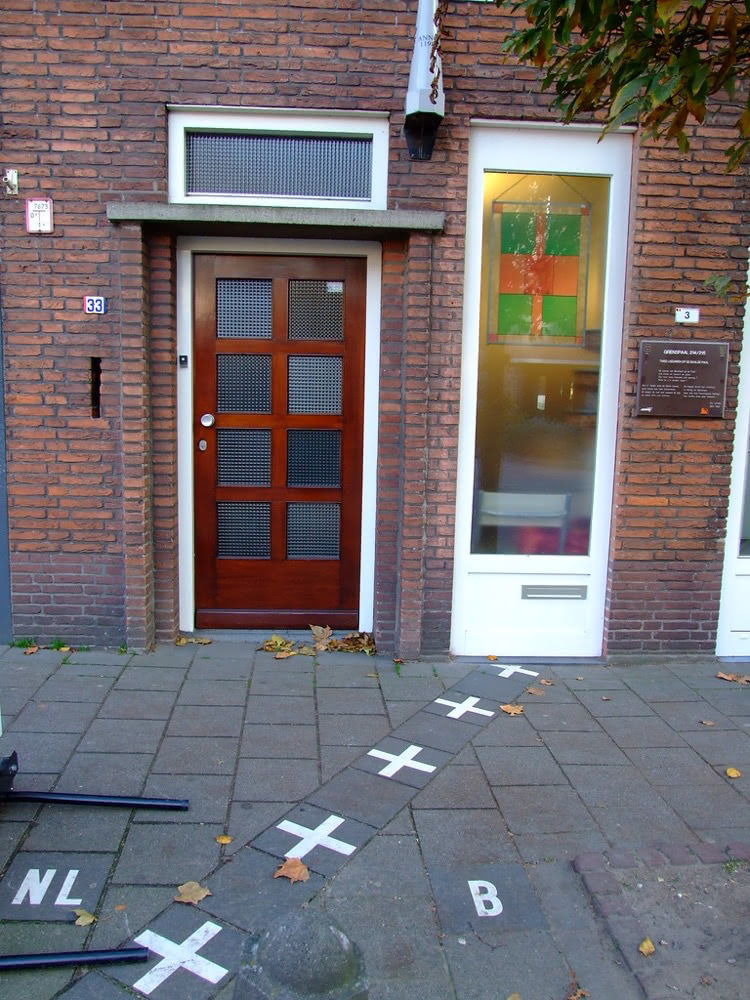
Street border in Baarle marked by white crosses and the letters NL and B running between two neighbouring doorways.

When walking through the town you will cross the border several times and it may happen that you wonder in which municipality you actually are. For a better overview all house numbers show the flag of the actual country. And usually the house belongs to the country in which the entrance lies. You also can see the border demarcation on the ground.
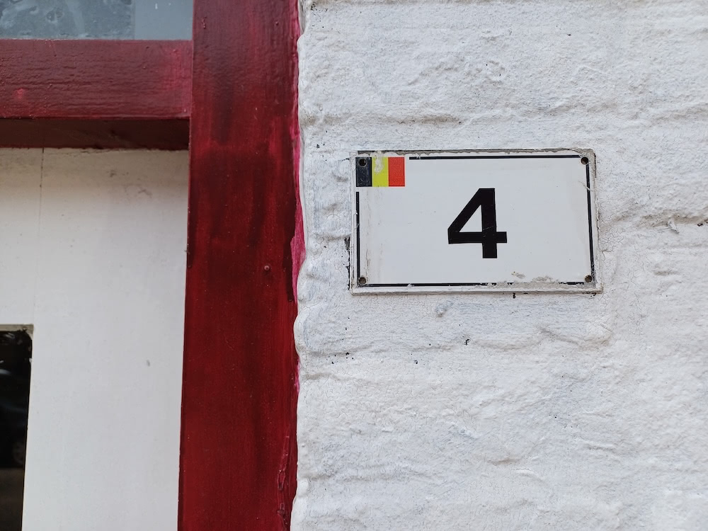
White house number plate with a small Belgian flag and the number 4 on a whitewashed wall.

But how has this strange situation arisen? Well, long story short: It all began in the dark Middle Ages. The border’s complexity results from numerous medieval treaties, agreements, land swaps and sales between the Lords of Breda and the Dukes of Brabant. Later on Breda became a possession of the House of Nassau, then Nassau-Oranje and finally the Netherlands while the parcels owned by the Dukes (in Flemish, the word Duke translates to “Hertog”) of Brabant went to the Duchy of Burgundy and finally became part of Belgium.
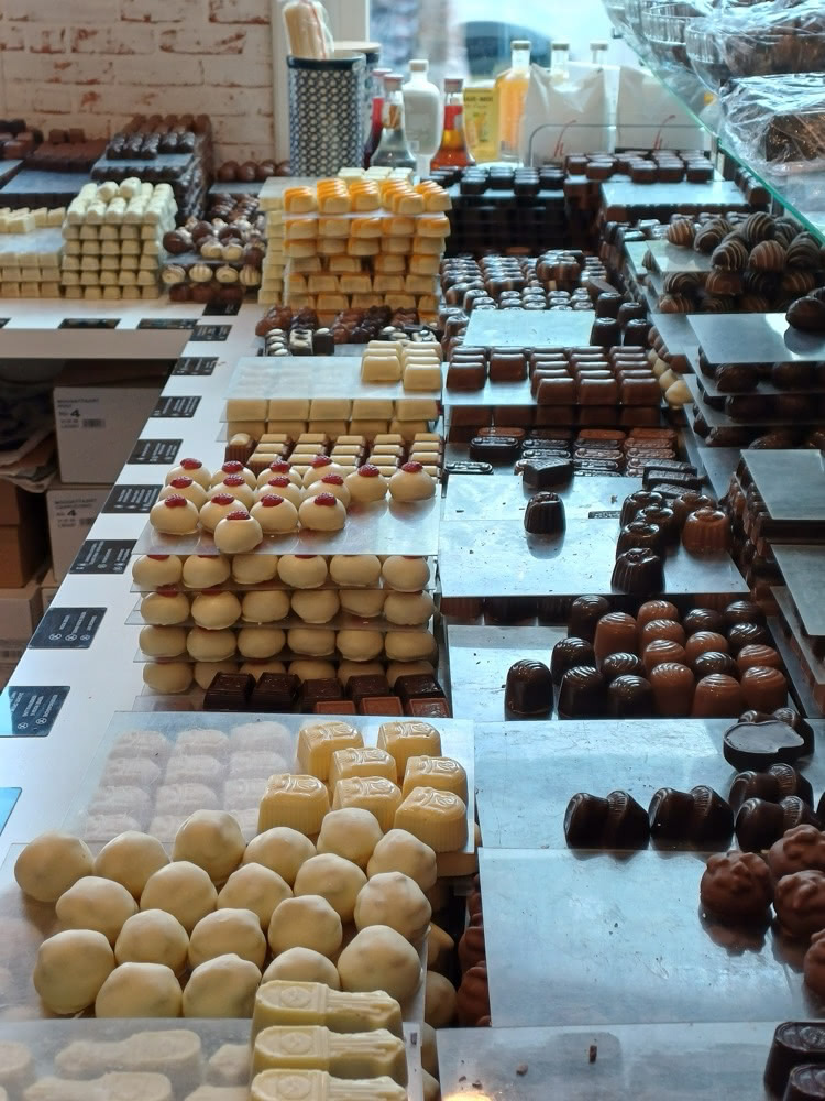
Counter inside a Belgian chocolate shop lined with rows and stacks of assorted pralines

So how is the situation today? In Baarle-Nassau/Hertog you can find the best things from both countries: Cheese, stroopwafels and liquorice from the Netherlands as well as Belgian chocolates, frites and monastery beers.
And more: There’s a Dutch garbage truck in the streets and a Belgian as well, there are Dutch and Belgian schools (and some Dutch children go to the Belgian school and vice versa since the languages Dutch and Flemish are very similar). And there are Dutch and Belgian policemen, sharing a joint police office!

And yes, there are two postal systems!

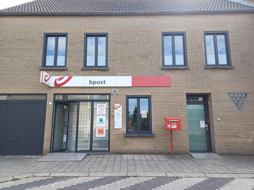
Small bpost post office housed in a brick building in Baarle with a red Belgian mailbox outside.

A Belgian post office bpost can be found in Baarle-Hertog and a Dutch PostNL service desk in a stationery shop in Baarle-Nassau.
So I thought I could go into travel mode and send two postcards from the Netherlands. And then two from Belgium. And again two postcards from the Netherlands and finally two more from Belgium.
The only challenge was finding WIFI from both countries to proove Postcrossing that I am sending from these countries. I found free Dutch wifi in a really nice café in Baarle-Nassau and Belgian wifi only a few meters up the street in a pub in Baarle-Hertog. Koffie met Gebak in the Netherlands and a cool drink in Belgium. Could be worse!
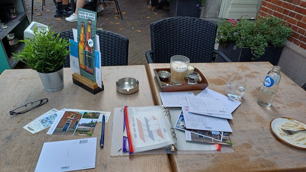
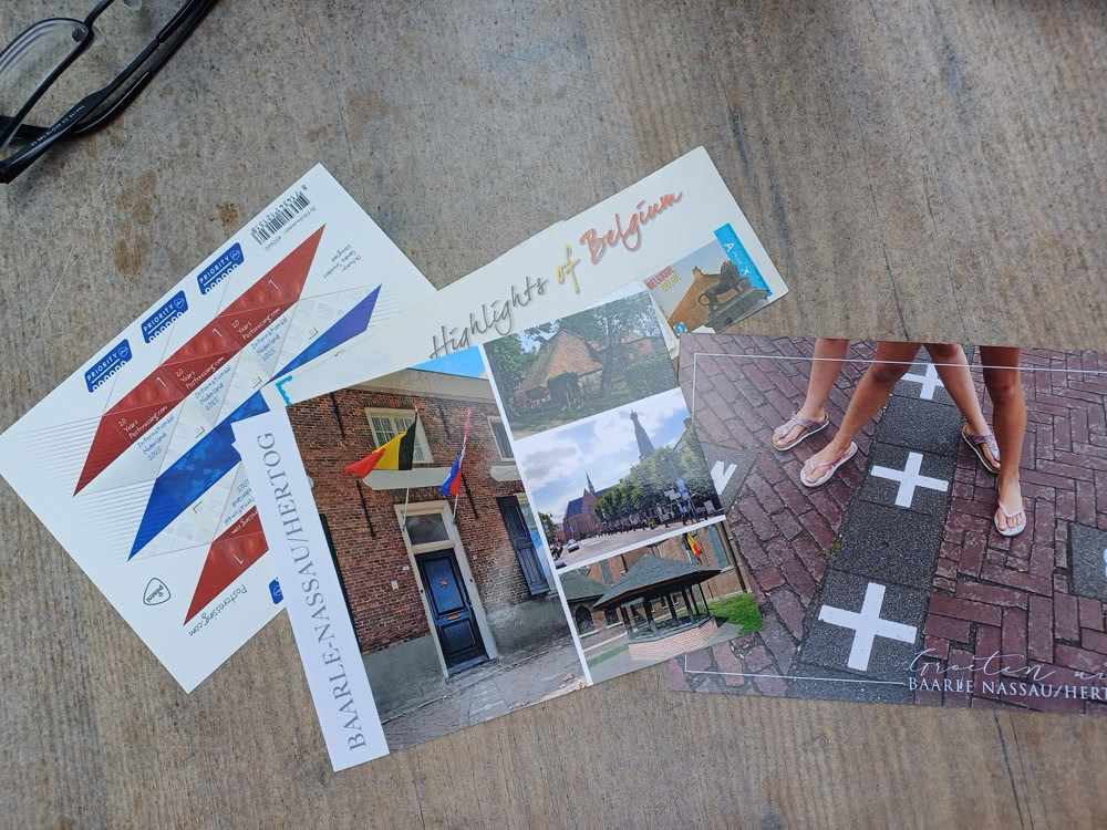
Spread of Baarle-themed postcards and Dutch priority stamps laid out on a wooden table

After drawing the addresses I decided to try something crazy: Putting stamps of both countries on some of the postcards and collecting the postmarks of both post offices!
Outdoor café table in Baarle with drinks, pens, and a stack of postcards being written and prepared to send.

Thanks to the kind and helpful staff in both post offices I was able to receive the local handstamp postmarks! Usually nearly all mail of both countries is cancelled in big sorting centres and not postmarked locally anymore. So I think these postcards are very special and I’m a little bit proud to bring some nice mail items into Postcrossing. Four cards went to the USA, three to Russia, two to China and two to Ukraine.
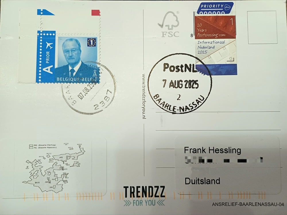
Back of a postcard bearing both Belgian and Dutch stamps with a Baarle-Nassau postmark and a small enclaves map.

And of course I sent one to myself ;-)"

  icon

To mark Postcrossing’s 20th birthday, PostNL commissioned Gouda‑based designer Sandra Smulders (whose portfolio already includes quite a few Dutch stamps) to create a celebratory stamp. On July 14, the new stamps went on sale — a lively sheet of red‑white‑blue zigzags that hints at both the Dutch flag and the criss-crossing of postcards. We especially like the unique dented pattern on the bottom of the stamp!

We spoke with Sandra about the ideas behind the design, the little details hidden in each stamp, and how it feels to watch her work fly through the mail in all the postcards. :)

What was your initial reaction when you were asked to design a stamp for Postcrossing’s 20th anniversary?

I am always happy when asked to design a stamp sheet. Usually, the ideas only come to me once I have delved into the subject, but with Postcrossing, I immediately saw the arrows in my mind’s eye. This ultimately became the basis for the design. So this subject suited me very well in terms of design. I therefore set to work on this assignment with great enthusiasm.

Can you walk us through your creative process for this stamp sheet — where did you start, and how did the concept evolve?

I began with two things in mind: a bold zig‑zag arrow pattern and a horizontal sheet with the stamps centered. From there everything clicked into place.

Sandra Smulders’ notebook sketches and notes: initial grid, arrow ideas, Dutch‑flag colour codes, and Postcrossing keywords.

The red‑white‑blue bars stretch across the sheet to form a subtle Dutch flag; rotating the bottom row of stamps 180° let the blue bar span two stamps and stay the same width as the red and white. To add depth I overlaid each bar with grey tints and simple monochrome icons that sum up Postcrossing: paper‑chain people for the project’s friendship, a world map on the blue “water” strip for global reach, and postcards, naturally. Hand‑written‑style lettering fills the remaining triangles, while the “sorting hook” and the value “1” sit opposite each other for balance. A few diagonal guide lines finish the sheet, tying the layers together and giving the design its sense of movement.

Close‑up photos of the new Dutch “20 Years of Postcrossing” stamp sheet showing the red‑white‑blue zig‑zag design and Priority labels.
Have you sent or received postcards yourself through Postcrossing, or do you perhaps have a special memory in connection to snail mail that you can share?

I don’t send or receive cards myself and I don’t (yet) participate in Postcrossing. But I do like to send and receive cards or mail. Receiving mail is so much fun. As a teenager, I had several pen pals and sent letters all over the world. I really enjoyed it when I received a reply. Who knows, maybe I’ll take this up again in the future.

As a stamp designer, what’s it like to see your work travel the world on thousands of postcards? :)

It’s certainly very nice that many people around the world will see my work. Even if they don’t know it’s mine. Who knows where my work will end up? And maybe this is a step closer to my international design career.

  icon

This week, we decided to highlight a lovely online exhibition we heard about from postcrosser OrangeSunshine. In 1926, the Dutch Postal Museum in the Hague received a fascinating donation: a trunk of around 2,600 letters from the seventeenth century, some of them still unopened to this day… This obviously got our attention, so we had to take a look!

The piggybank of letters
The Brienne trunk, Sound and Vision, The Hague (CC BY-NC 4.0)

It seems that the trunk was originally owned by the postmaster and postmistress of the Hague at the time, Simon de Brienne and his wife, Marie Germain. Inside of it were all the letters that the post office could not deliver, either because of indecipherable or non-specific addresses, deceased recipients or people that moved… or because the recipient did not want to pay to receive the letter, as was the rule at the time. The chest was called the “piggybank” (spaarpotje), because they hoped to collect the money eventually if the letters were delivered one day!

An undelivered letter
DB-0259, Sound and Vision, The Hague (CC BY-NC 4.0)

The archive has recently been rediscovered and pored over by experts of all kinds, who have been hard at work preserving and digitising the collection, and you can see some of the fruits of their labor in the virtual exhibition!

A folded letter
Opened Letter, DB-2146, Sound and Vision, The Hague (CC BY-NC 4.0)

One of my favourite aspects was learning about letterlocking (discussed more in room 4 of the exhibition). These intricately folded letters were intended to preserve the privacy of the letter-writers against the so-called “Black Chambers”. These where secret workers within the post office who would open, copy and reseal letters in order to spy upon the contents for the government! Other people used codes to write their private letters, making their contents unintelligible if you didn’t know the trick to deciphering them. You’d have to be careful to make sure that the coded nature of the letter wasn’t too obvious, or that would only draw suspicion…

We definitely recommend you take a look at the whole exhibition if you’re interested in this little piece of history. There’s tons of information there about who wrote letters and what they wrote about, and the materials and writing implements they used to do it, providing a fascinating glimpse into another era. If you check out the exhibition, we’d love to hear about what you think! What’s the most interesting thing in the collection from your point of view?

  icon

On a recent Instagram browsing session research expedition, I accidentally stumbled on Amy (aka amyvnwijk)'s colourful account, and was immediately captivated. The stamps, the washi tape, the airmail stickers… Her creations are awe-inspiring, every postcard a miniature piece of art!

I was curious to find out more about her mailings, and luckily, Amy agreed to answer a few questions about it, so we had a mini-interview! Here she is to tell us more about her gorgeous postcards.

Can you tell us a little bit about your decoration process? What inspires you?

I get most of my inspiration from the season we are in or the place where I’m at. I love traditional Dutch images or illustrations, flowers and nature, so I like to incorporate that in my mail as well. Along with lots of bright and happy colors of course! A few examples:

Photo Dutch Mail Photo Holiday   Summer Mail

Dutch and holiday/summer themed mail

Photo Christmas Mail Photo Color Themed Mail

Christmas and color-themed mail

Where do you start?

I start with choosing the stamps. If it’s a certain season or holiday I like to use stamps and tapes complementary to that. If I go for a colored theme I match the colors of the stamps together with a same colored washi tape. I always begin by making a border around the card with the washi tape. Sometimes I use small tape but if the tape is a little wider I cut of the excess with a scissor. Then I stick on the stamps and the priority label. Finally I use rubber stamps. While the ink of the rubber stamp is drying I go to the next card and when everything is decorated I start writing.

Which materials do you use to decorate your postcards?

I mainly use washi tape and rubber stamps to decorate my postcards. My favorites are tapes with floral prints because they are always very cheerful. I also like using rubber stamps — for official Postcrossing cards, I use a Postcard ID-stamp. For writing I use colored gel pens or fine liners. As an extra stamp I like to use an old Dutch “gulden” stamp. They are no longer allowed as postage but I think they are beautiful and a nice decoration to the card.

Amy's Decorated Cards

Some other useful materials are a pair of (small) craft scissors, a ruler and a retractable knife. I try to stay away from glue or really sticky deco tape because it’s easy to stain the card and hard to correct when you make a little mistake. Paper tapes, like washi tape, are a lot easier to remove when you decide to go for something else or need to make an adjustment.

What are the member’s reactions when they receive your postcards? Do they appreciate the extra effort?

I love choosing and decorating cards the best from the whole Postcrossing experience! I enjoy sending happy and colorful mail and when I read on the profile that the receiver likes it as well, I get excited straight away. Sometimes it’s a bit of a gamble if the receiver would appreciate it, but I’ve received a lot of positive feedback on my sent cards so far. A few weeks ago a woman wrote in her hurray message that she would frame my card — that really made my day.

And finally, can you show us the place where the magic happens?

My desk is also my work and laptop table so when the addresses are requested the laptop goes to the side so I have enough room for my craft supplies. I keep everything in basic storage boxes in a cabinet so when the crafting and writing can start I bring everything I need over to my desk.

Amy's desk

Thank you Amy, that was lovely — I’m really inspired to beautify my postcards now!

Do you decorate your postcards too? If so, share your own tips below!

  icon

Welcome to July! To enter our anniversary month on a celebratory note, we’re starting it with a great giveaway sponsored by Natuurlijkefoto.nl — a friendly website that is perfect for postcrossers who love nature! :)

Run by professional photographer Arnold Voordewind, Natuurlijkefoto specialises in nature photos, including animals and landscapes, with special emphasis on the Dutch ones. His photos are stunning, so it’s no surprise that the postcards are such high quality and so sought after!

Natuurlijkefoto is offering 3 sets of postcards to 3 lucky postcrossers! Here is the 3rd prize, with 10 postcards:

Natuurlijkefoto weekend giveaway

The 2nd prize consists of all those postcards above, plus these 10 below…

Natuurlijkefoto weekend giveaway

And last but not least, the huge 1st prize winner will get aaaaaall those postcards above, plus these ones as well:

Natuurlijkefoto weekend giveaway

Fantastic, right? For a chance to win one of these sets of postcards, visit Natuurlijkefoto.nl's website and leave a comment below, telling us which series of postcards is your favourite! From animals to mailboxes, boats to lighthouses, we’re sure there’s something you’ll find exciting there!

Good luck everyone! Check back on this post next saturday for the winners (randomly picked by Paulo’s number generator, like always).

PS – Until July 8th, Natuurlijkefoto is also offering a 20% discount on all orders above €20. Use the discount code “weekendgiveaway” during checkout to claim that offer.

And the winners of this giveaway, as chosen by Paulo’s random number generator are… ioana-iulia (3rd prize), maurin88 (2nd prize) and Katycakes (1st prize)! Congratulations ladies, and thank you everyone who participated. Stay tuned for the next giveaway soon! 😊